
project details
REEF Mobile - Parking Made Easy
Get to where you need to be, worry free. REEF Mobile is the easy way to find, compare, and pay for parking by phone at lots & garages near you. Whether you’re on your daily commute or exploring new places, we have a parking spot for you.
The Brief
The goal for this project was relatively simple. We wanted to create a mobile parking solution for REEF parking lots and garages which would allow users to find and pay for nearby parking easily. I worked on a team of several mobile developers, a product owner, a technical product owner, and a scrum master. We worked in two-week sprints with the product team being several sprints ahead of development.
An important theme throughout this project was research. Starting an app almost completely from scratch required of a lot of research on competitor flows and general best practices. We organized this project into features, working on one major feature at a time. This case study will follow a relatively same format to take you on the journey of this app being built.
Initial Research
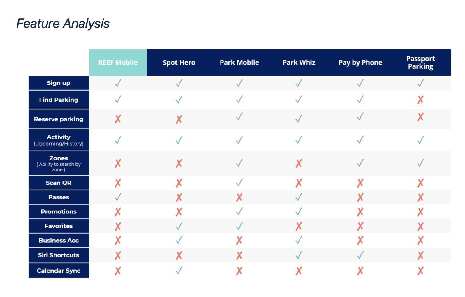
I started with researching best practices for mobile design, since I hadn’t built such a large mobile application from concept before. I made a competitor feature matrix to analyze our competitors’ features and see where we can excel in the market.
Account Creation & Login
As a logical next step, we worked on account creation and login. After meeting with stakeholders, I learned that the preferred method for account sign-up and login is phone number from a business and technical perspective.
I started by researching the different types of login flows, including phone, email, third-party, and hybrid. I audited several competitor’s login flows, and using those audits, I created a competitor matrix showing the different ways users can login on competitor apps. Many had very simple login flows, like SpotHero (shown below).
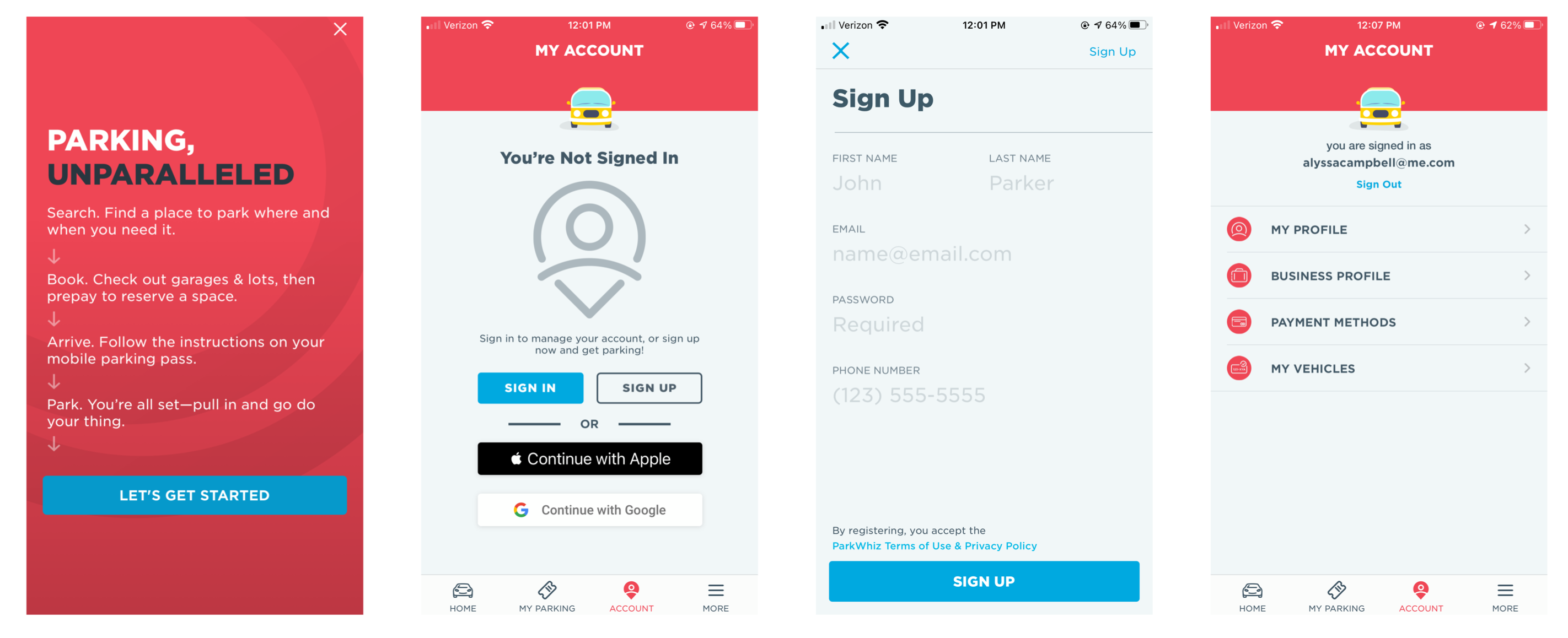
I also did research on sign-up best practices. The biggest key takeaways from that research were to consider removing any unnecessary form questions, and to be sure to explain the value of providing information like phone number or email if it doesn't seem essential.
I created user flowcharts for sign-up and login and presented it to the product team. I explained that the longer and more complex it gets, the less users are likely to finish the sign up process. My proposed sign up flow includes asking for phone number OR email, like Facebook and Twitter’s login patterns. This doesn’t assume which the user will want to use, and saves them an extra click if they’d prefer one way over the other.
Signing up with Google or Apple is another easy option for the user, but sometimes we don’t get the information we need, like their personal email for receipts. I decided that the best solution is the ability to add it later if they'd like to email a receipt, which helps the sign up process by eliminating a step.
Home Screen
My main goal of auditing competitors home screen designs was to understand how they display multiple pieces of information in a small space. I categorized the apps by whether or not their home screen had a full-page map. One of the benefits of not having a full page map is the ability to surface information that is useful to the user based on the context of their actions. I created a matrix of the features displayed on each app’s home screen.
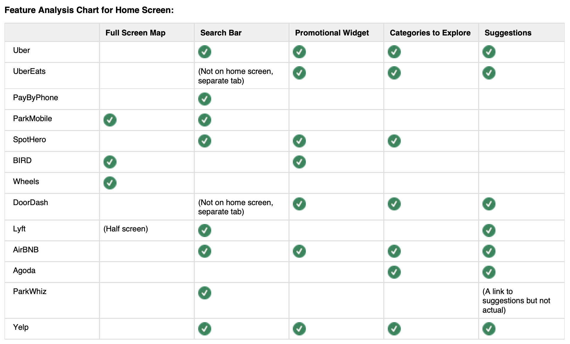
I researched maps, and learned how users interact with maps and their pain points. In my research, I found out that people gravitate to search to find locations. A study found 80% of users go to search engine or dedicated mapping app to when trying to find a nearby location. On mobile apps, providing the option to toggle to a map view of location results is a good practice, but the default view should be the list layout since it provides a higher information density for location options. Taking in this information, we decided to create a more flexible home page vs. a full screen map.
I also researched different home screen content layouts, and wrote the pros, cons, and takeaways for each. For example, I looked at the “Home Screen Icons” pattern shown below. I followed the same format for Cards, Search Bar, Suggestions, Hero Banner, Map Widget, Bottom Navigation, Search Accelerators, Sliding Drawer, and Carousel.
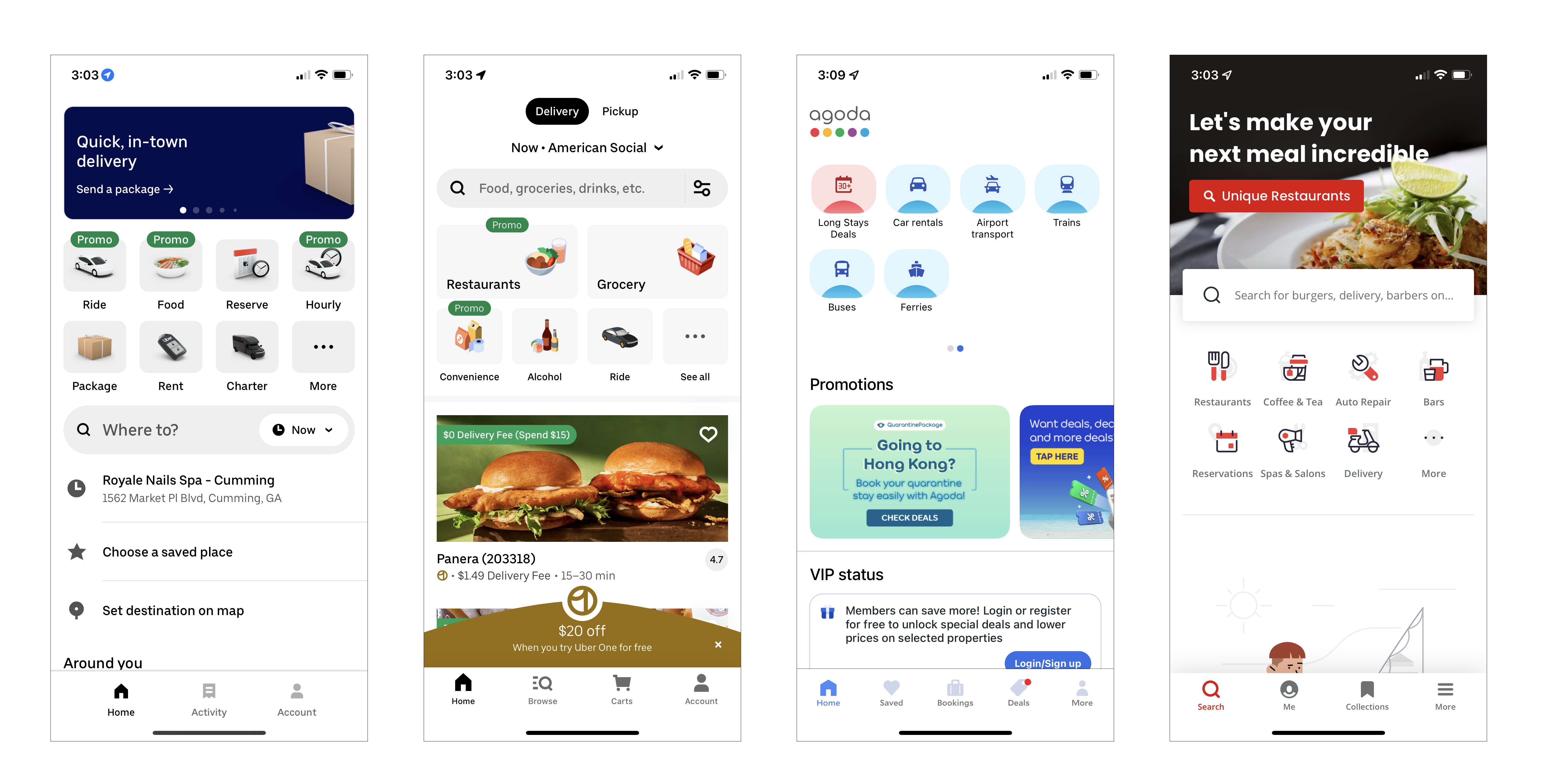
Pros: Having icons can surface multiple applications to the user. In a “mega-app,” this allows users to see all of the actions they can take.
Cons: This can be overwhelming to the user because there is a lot of options. The more choices you present a user with, the longer it takes to make a decision (Hick’s Law).
Done well: Yelp’s more icon takes you to a list to all of the different categories.
Takeaway: This may not make sense if we’re only offering short term and long term parking, but as the app expands into other lines of business, it could be a good option.
With all of this information, I began designing the home screen. With the product team, I wrote the user and business goals.
User Goals for Home Screen:
• Pay for parking
• Search parking & ability to filter
•Ability to view active session & extend it
• Access parking permits
• Go to account settings
• See favorites/recents
Business Goals for Home Screen:
• Room for marketing space
• Show alternate use cases
There were three scenarios to look at that I used as a base for my lo-fi designs. The user either is searching for parking, is wanting to buy parking for a lot they're currently at, or already has an active parking session.


From the lo-fi designs, I received input from stakeholders and created mid-fi designs. One included a large map, and the other utilized a card format.
I did user testing with five users on the home screen layouts as well as two different types of navigation. I took the data from the testing and applied it to the high fidelity designs.
Searching for Parking
Searching can make or break conversion rates, so it’s important to bridge the gap between the user and the product they seek. Search seems to be simple at first glance. Provide results that match what the user is looking for, right? When I began to dig in to it and looked at the different aspects of a well designed search page, I realized that there is many additional features to a great search flow, like auto-suggestions, instant results, and related searches.
I also looked at general best practices and best practices for mobile searching, which included things like providing sort & filter functionality and managing poor connectivity by showing progress (e.g. a skeleton screen).
I tested the first pass at the design with three users and concluded a few takeaways from the testing, including that all three users would search by the name of a location, not an address or parking lot name. I also learned the standards for naming the pins needs to be very clear so the user knows what they’re looking at, and the bottom drawer for list view needs to be prominently displayed while closed, so the user realizes it was there.
Based on the user feedback, I updated and finalized the search flow.

Checkout Flow
Checking out is the most important part of an entire e-commerce experience because it is where all the work we've put into customer acquisition, education, and retention actually converts to revenue and ROI.
I started this feature by doing a competitor audit and researching best practices. I found that most websites listed in the top 40 e-commerce sites (by traffic according to Alexa.com, 2018) remove navigation during checkout to avoid distractions, use keypad inputs for number fields, and allow guest checkout. I also did a competitor analysis of PayByPhone, ParkWhiz, ParkMobile, and SpotHero.
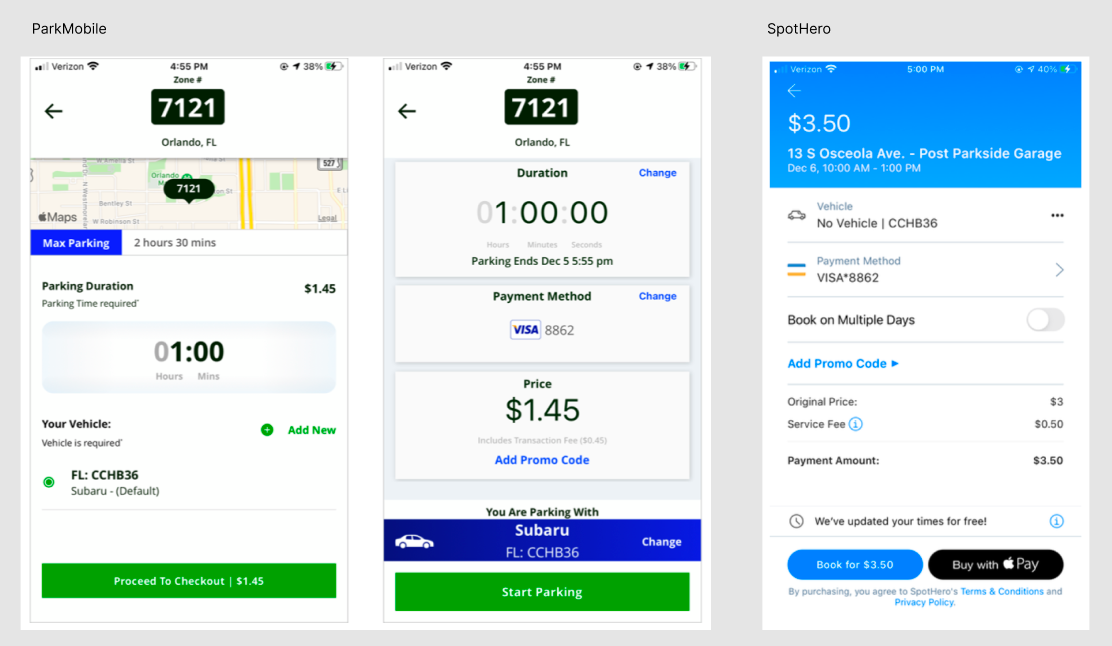
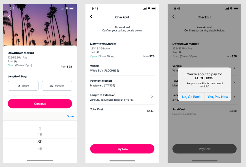
I created and tested three mid-fi flows with four users. The tasks were to park their car for six days, checkout as a new user, and change the vehicle & payment method whilst checking out. Some of the key takeaways from user testing were the following:
• Users wanted to know the expiration time on the duration picker
• Users appreciated the vehicle confirmation screen
I was able to add this feedback into my designs, including updating the way the duration was displayed in the checkout page to include the time of expiration.
Account Management
Lastly, I worked on settings and account management. I know account management isn’t quite as exciting as the home screen, but it’s important that the user is able to manage their vehicles and payment methods with ease.
I started this feature by doing a card sorting exercise, so I could better understand user mental models and how others categorize information. I did an open card sorting, so there was no constraints on how users could organize the cards. A total of seven users completed the exercise, leaving me with data to analyze how I can best approach navigation for settings and account management.
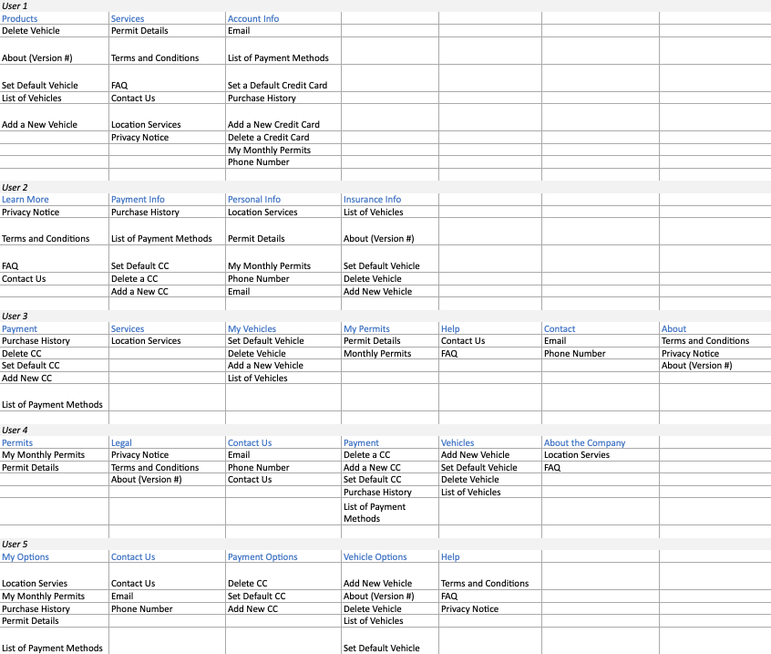
I did a competitor audit of settings screens for Uber, Lyft, Waze, VRBO, SpotHero, ParkMobile, BIRD, Wheels, Turo, and AirBnB, inlcuding the vehciles and payment method management screens for the parking apps. Based on the card sorting exercise, research, and competitor audit, the account settings screens were created as wireframes. I tested the wireframes with three users to validate the information architecture. I asked the users to complete different tasks using the side navigation, like finding the version number of the app, emailing yourself a receipt, and adding a new credit card.
All three users, including an older adult who doesn’t consider themself tech-savvy, felt the tasks were easy to complete using the account settings/menu. Based on the feedback, I continued to mockup the settings pages into high-fidelity designs.
Working with Product
This project was managed in Jira, where we created user stories as tasks to complete. We ran brainstorming sessions in Miro with key stakeholders in the company to understand business objectives through each part of the app.
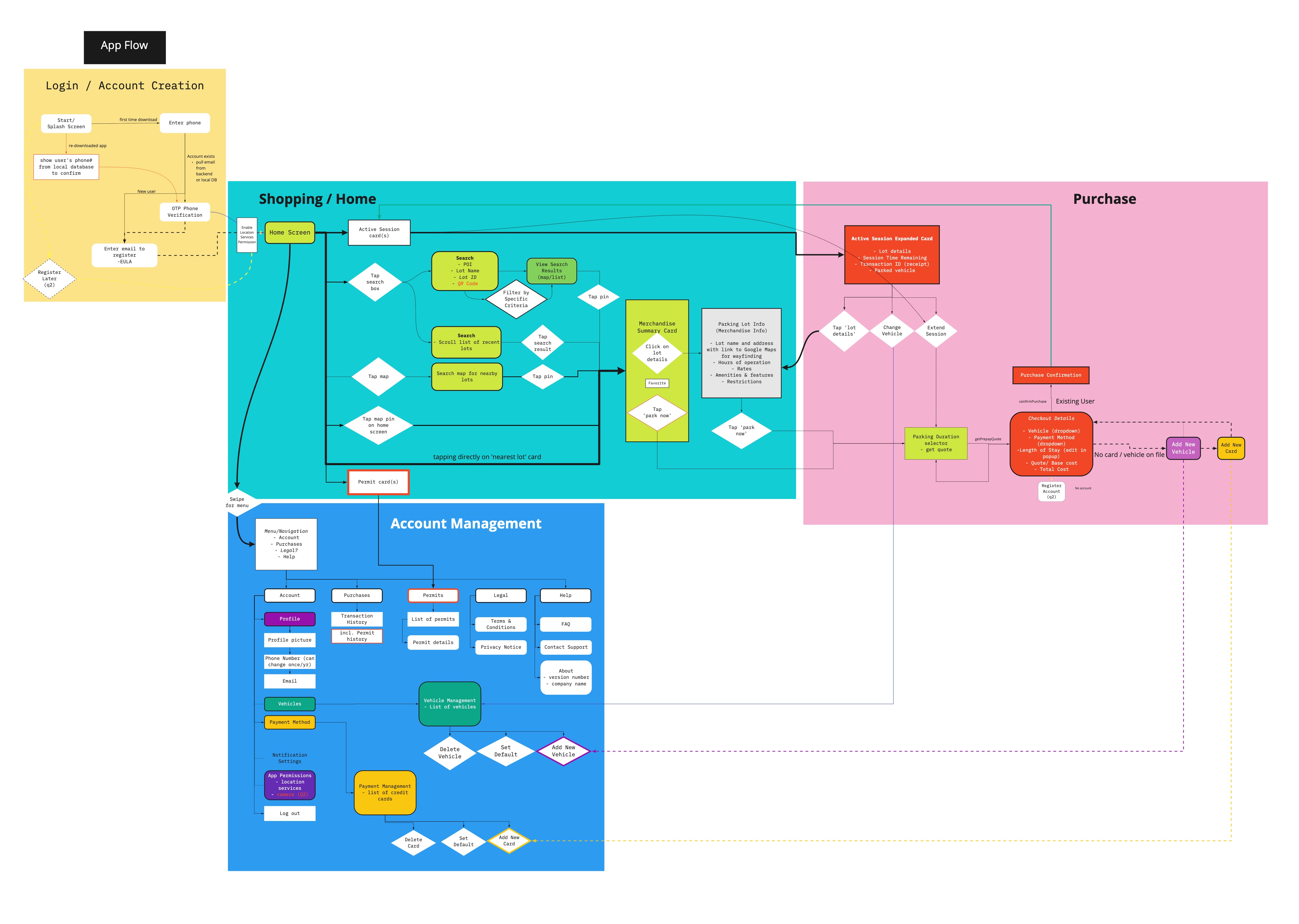
As we worked through the individual features and flows, the product owner and I kept a Miro board up-to-date with a mobile app flow, so that developers and stakeholders were able to understand the flow and work still needed within the project. This allowed us to manage the project, stay on track to complete each individual flow, and better explain how the flows connected to one another.
Final Designs
Check out the high-fidelity walkthrough of the login, search, checkout, and extend session flows below.
Challenges and Takeaways
As my first end-to-end project, it was exciting to be able to bring an app to life from nothing. A lot of my time was spent in the ideation, workshop, user flow, and overall "design thinking" space on this one. When it was time to wireframe and design, that part came easily because of the low-fidelity ideation that was done at each step.
Working in a pod of a product owner, technical product owner, scrum master, developers, and QA was also new to me in this project. We worked in two-week sprints, and I found it challenging to prescribe the same structure and goals to my work as a development team on Jira. I also started this project at the same time as the developers, and besides a few tech spikes, we were working on the same schedule. This is when I decided I will always be at least two to three sprints ahead of development (famous last words, haha!).

.svg)
.svg)


.svg)